Techshed by The Home Depot
Become a Pro Landing Page
The Pro Referral 'Become a Pro' landing page is where service providers, also known as Pro's, can start an application (sign up) or log in to continue and existing application to become a Pro with The Home Depot Pro Referral Program. Pro's can read about the requirements, benefits and values of joining the platform. They can also view testimonials of the Pro Referral program.
Problem
At the time of projects inception, only 15-20% of users who began a Pro Referral application become a operational Pro. The remaining users dropped off during the application process. Some of these users were then placed into call campaigns that encouraged them to resume their application.
Goal
- To increase the total number of Pro's from application to operational.
- To increase Pro conversion rate / decrease drop-off rates of applicants.
Research findings focused on
▶ High Impact - Short Form Dominance and Dissuasion
Feedback:The short form takes up a large portion of real-estate of the hero on both Desktop and Mobile, leading to initial hesitation / defensiveness and missed content by the Pro's in their review of the platform.

- The space that the hero and short form take up on Desktop and Mobile can suggest that there is no more content below the fold.
- Being shown a short form immediately may dissuade some Pro's and put them at a defensive to continuing about learning the platform and signing up.
- Consider a progressive reveal of needed information in order to shorten the info request on the landing page.
- Explore methods to highlight that more content is available below.
▶ FYI - Headline Text is Most Likely to be Read
Feedback:For blocks of text, the headline was more likely to be read while the text below was more likely to be skipped or skimmed.

- Pro's tended to read the headlines of text blocks - which meant that smaller text below tended to be skipped or skimmed.
- Consider taking action based on this behavior if content that is definitely important to know is below the headline.
▶ Not Clicking on 'How it Works' Steps
Feedback:The complementary images were not seen for the steps because they were not clicked on.

- The space that the hero and short form take up on Desktop and Mobile can suggests that there is no more content below the fold.
- Pro's did not click on the steps - as such, the visuals to complement the step were not seen, though there was hover behavior.
- Consider having the image change based on hover rather than click.
▶ Specific Requirements Information Seeking
Feedback:Elements that are on the page to help Pro's understand the specifics of requirements were not used.

- None of the Pro's checked their licensing requirements using the license checking tool.
- One Pro was curious to see an example of General Liability but did not want to click on the ‘See an Example’ link because of not wanting to be taken to another page / off the current page.
- Work with UX Copyrighter to explore better language that may speak more to a curious Pro.

Hypothesis 1
We have observed that Pro's were starting an application and dropping off because they didn't understand the value of Pro Referral.
We believe that improving the Become a Pro landing page and information and visual hierarchy of the Become a Pro page will help qualify Pro's who start the application.
We will know the hypothesis is valid if we see a higher percent conversion of users who become an operational Pro, as well as a decrease in drop-off rate during onboarding.
Hypothesis 2
We have observed that Pro's starting an application and dropping off because they did not understand the requirements to become a Pro.
We believe that re-arranging the page elements will improve the visual hierarchy of the page and will qualify Pro's why start the application.
We will know the hypothesis is valid if we see a higher percent conversion of users who become an operational Pro. This also means a decrease in drop-offs during the onboarding flow.
Areas to focus on for MVP
- Intuitive Scrolling. Help users understand there is content below the fold.
- Information and Visual Hierarchy. Determine how to display the (1) application requirements and (2) services provided.
- Navigation Bar. So users can easily navigate to each section of the page.
- Short Form. Either hide the short form altogether and condense it to a single CTA, or determine an appropriate place to.
Key Metrics
- Track the conversion rate of users who became opterational Pro's over the number of users who started an application.
- Track the drop-off rates of each of the 5 steps in the Onboarding Flow (name step 1, etc).
- Track the number of users who start an application before / after making changes to the landing page.
- Track the total number of newly converted Pro's before /after making changes to the landing page.
Competitors Studied
Prioritization of research findings to focus on
We decided to focus on the top research findings that related to navigation of the page. Robust information scent (the extent to which users can predict what they will find if they pursue a certain path through a website or the users ability to find the information they're seeking) and communicating that there was content below the fold. Reducing the cognitive load on Pro's in terms of content of the page, as well as reducing manual form input.
Information and Visual Hierarchy
Through conducting interviews with business, doing a competitive analysis and with feedback from Pro's, I found that the section ordering of the landing page did not clearly explain to Pro's the benefits of signing up for Pro Referral.
Through research, we found that it was more important to Pro's that they know what services they could offer as part of their business, rather than having the requirements presented after how the program works. The mobile app demoted as well, since even though it was helpful to have, it wouldn't be a deciding factor in whether they signed up or not.


Short Form, Simplifing Copy, Intuitive Scrolling & Navigation
Forms suck, we know this. I wanted to reduce manual form input as much as possible, or altogether. Most of the information we were asking for in the short form*, would be asked for during the application process in some way. After several iterations, we decided to remove it altogether.
* Short form, because there is a much larger form waiting in the application.


Simplifying Information Presented
Reduce clicking and cognitive load. Our users tended to skim, rather than read in depth. The original version of out 'How it works' section did not do a great job signifying that there were additional images for users to see, if they clicked on sections. I decided to redesign this section revealing information in silos to eliminate unnecessary clicking by the user.


Changes, Original to Final
The final page design through several rounds of iterations resulted in a formless easy-to-skim experience, reducing and refining the copy, and offering more important information to the service provider.


My Role and Who I Worked With
I was the lead designer, and worked with my UX copyrighter, engineers and product manager to create this project.
Performance Page
Problem
Pro Referral uses an algorithm to match Pro's with customers. However, its shortcoming is that it doesn't educate and inform the Pro of this process; which in turn does not allow them to visualize their success. By not informing Pro's of how to efficiently and effectively use the platform through transparency, we ultimately put them at a disadvantage by not letting them take ownership in their own success.
Goal
Educate Pro's on how to use the platform and how to perform well based on our performance metrics in Pro Referral, by showing the most important factors for business, display performance in an easy to understand manner and offer a more granular view per occupation, so that Pro's are aware and motivated to take the actions needed to improve company performance.
Value Proposition
The Performance Page works by displaying Pro account performance in the Pro Match algorithm, giving users of the account an easy to digest display of information. This will help users improve performance by educating them on the metrics that are important to platform success.
By educating Pro's how to succeed, they will be able to improve their performance on their own, leading to more jobs won and more spending in The Home Depot stores for materials.
Discovery: What problem's are we solving?
- We aren’t being transparent about how to be successful on our platform, and the metrics involved in Pro success.
- Pro's are not performing well because they don’t know how to perform well:
- Pro's aren’t educated enough on how to succeed on the platform.
- They aren’t learning to use the platform to make it work for them.
- They aren’t taking the action we want them to, because they don’t know the impact (passing vs contacting vs status disposition, etc.)
- Our KPIs for Pro success are confusing, because we haven’t defined/presented to them. We need to define them to Pro's so they can understand how they affect them.
- We aren’t displaying the performance we’re tracking of individual or account level.
- We want to be transparent on the metrics to Pro's that are important for us and for them to rank better (get more leads). Caveat: we need to make sure we do it in a way that they don’t take advantage of the system, but are able to be successful and knowledgeable.
Project Scope
- The scope of the project incorporated a design for the Performance Page.
- A mobile first design (mobile web, mobile app) and desktop.
Targeted User Group
- Pro's (Service Providers)
- Office Administrators (sometimes also a Pro)
How did we get here?
- By conducting expert interviews with stakeholders from Business, Operations and DAS (Data and Analytic's Services).
- By questioning and understanding the individual metrics and variables that go into the Pro Match Algorithm.
- Exploring and examining past interviews with Pro's and Office Admin's on feedback on the Pro Jobs Dashboard.
- Developing personas based on the learning from above.
What are the goals?
- Educate Pro's on how to use the platform and how to perform well based on Pro Referral’s performance metrics
- Display performance in an easy to understand manner and offer a more granular view, so that Pro's are aware and motivated to take the actions needed to improve company performance.
We want Pro's to understand things, like...
- “Acceptance Rate (and pass rate) is the number one deciding factor on lead distribution currently in our algorithm. That being the case, the Pro should know that by passing on leads 90% of the time, it is extremely detrimental to their future leads.”
- “If we have the right metrics in place, we know that they will self-regulate their behavior. Pro VOC going up, Greater transparency. Acceptance rate be higher, Response Rate be higher as well. Acceptance Rate should be called something else.”
- Business and Operations
Success Metrics
- Increase Response Rate
- Improve Pro survey feedback
- Increase rate of Pro's contacting customers
- Reduce call center calls
- Increase Pro reviews (total count and rate)
- Increase Pro engagement
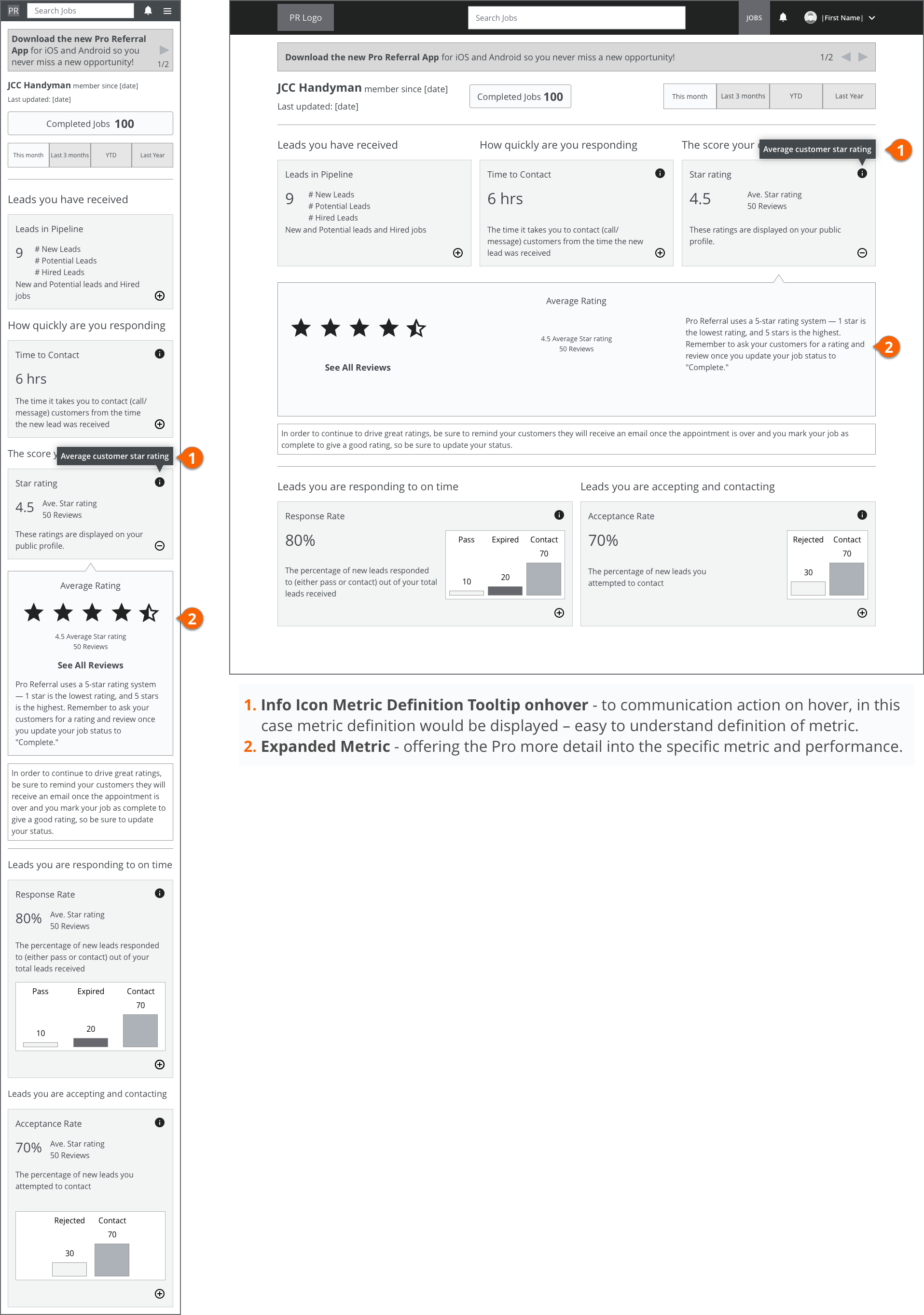
Data to display on front-end
- Response Rate (Response Score)
- Pro's to Customer to Pro Contact Rate
- Average Rating
- Rating Counts
- Pro Reviews (total count and rate)
- Number of leads
- Acceptance Rate - Pro's making contact with customer
Whiteboarding and Sketching


Personas
New User - No Leads
We don't do a good job educating Pro's how to succeed on the platform after onboarding.
If they aren't educated on how to succeed on the platform, they won't be able perform well consistently.
Goal
- Educate Pro's on how to use the platform to start off performing strong and continue improving their performance.
- Be transparent with the variables we use to measure performance.
The Long-time User Problem
Pro's that have been using Pro Referral for awhile haven't been educated on how to efficiently and effectively use the platform.
The metrics and variables that are related to the matching algorithm and determine which Pro's are matched up to customers have been changed many times. This hasn't been communicated to Pro's in enough detail to change their behavior for the better.
Goal
- To display performance in an easy to understand manner.
- To provide a definition and explanation of the performance metrics.
- To give guidance on how to improve and keep up performance.
The CRM Pro Problem
Pro's that have larger businesses and may be part of a larger parent company often use 3rd party CRM platforms to manage their leads.
They have a more complicated business model and don't have a way of tracking performance of crew members by individual occupations. They use their CRM applications to view performance as well.
Goal
- To offer a more granular view of company performance down to an occupation level.
Round 1 - Version 1 Wireframes
Round 2 - Version 2 Wireframes


Round 3 - Version 3 Wireframes


Round 4 - Version 1 Visual Designs


Round 5 - Version 2 Visual Designs


MVP
- Include Performance Page in navigation on all platforms.
- Display dashboard with main KPIs
- Dispaly User’s KPIs (individual vs nationwide avg and/or avg top Pro's)
- Condense view for mobile account level metrics
Later Phases
- Include customer contact rate and breakdown
- Comparison vs nationwide and/or top Pro's
- Drill-down to more detail (account vs occupation)
- Pro's with no leads use case
My Role and Who I Worked With
I was the lead designer, and worked with my UX copyrighter, engineers and product manager to create this project.