Pivotal Analytics
Contextual Marker
My role
Lead Product Designer, responsible for Pivotal’s commercial healthcare real estate mapping software. Implemented an ongoing UX Design Research and Testing process. Worked within, contributed and maintained Pivotal’s design system and language.
Project summary
Problem: Visualizations can be beneficial or detrimental to an end users ability to ingest project analysis
- Users can become overwhelmed with visualizations in their projects markets due to similar colors/layers blending against one another.
- An abundance of information might not be relevant to an individuals project or even deter the narrative the end user wishes to convey.
- Depending on what information / layers they've activated in their project, the visualizations in the users market can cause cognitive overload with the amount of information that is presented on the map in their project markets.
Solution: The ability to initially load a simplified version of the location marker to only communicate geolocation of the facility or a group of facilities. Once loaded, the user can have ability to add additional visualization that serve their needs.
Use Cases
Easing cognitive load
Simplify markers and icons
- What facilities are located at specific addresses
- Simple icons for understanding the majority of facility types at that location
Being able to quickly glance at markers and understand if a user wants to learn more about that location without having to commit and click (to find out more, leading to time wasted and aggravation).
By using simple iconography of facility types, we're able to give the user a bird's eye view of what services exist in the map area being viewed.
User story
As a Pivotal user, I want the map to be easy to understand and only have the information that’s relevant at that point of my journey to be presented.


Access affiliation information
As a Pivotal user, I want to know the system affiliations of the facilities shown on the map, so I know which facilities are of my customer vs their competitors.


Seeing buildings in a cluster
Simplification of clusters
- Number of addresses / locations
- What is in the clusters
- Search
- To zoom or not to zoom
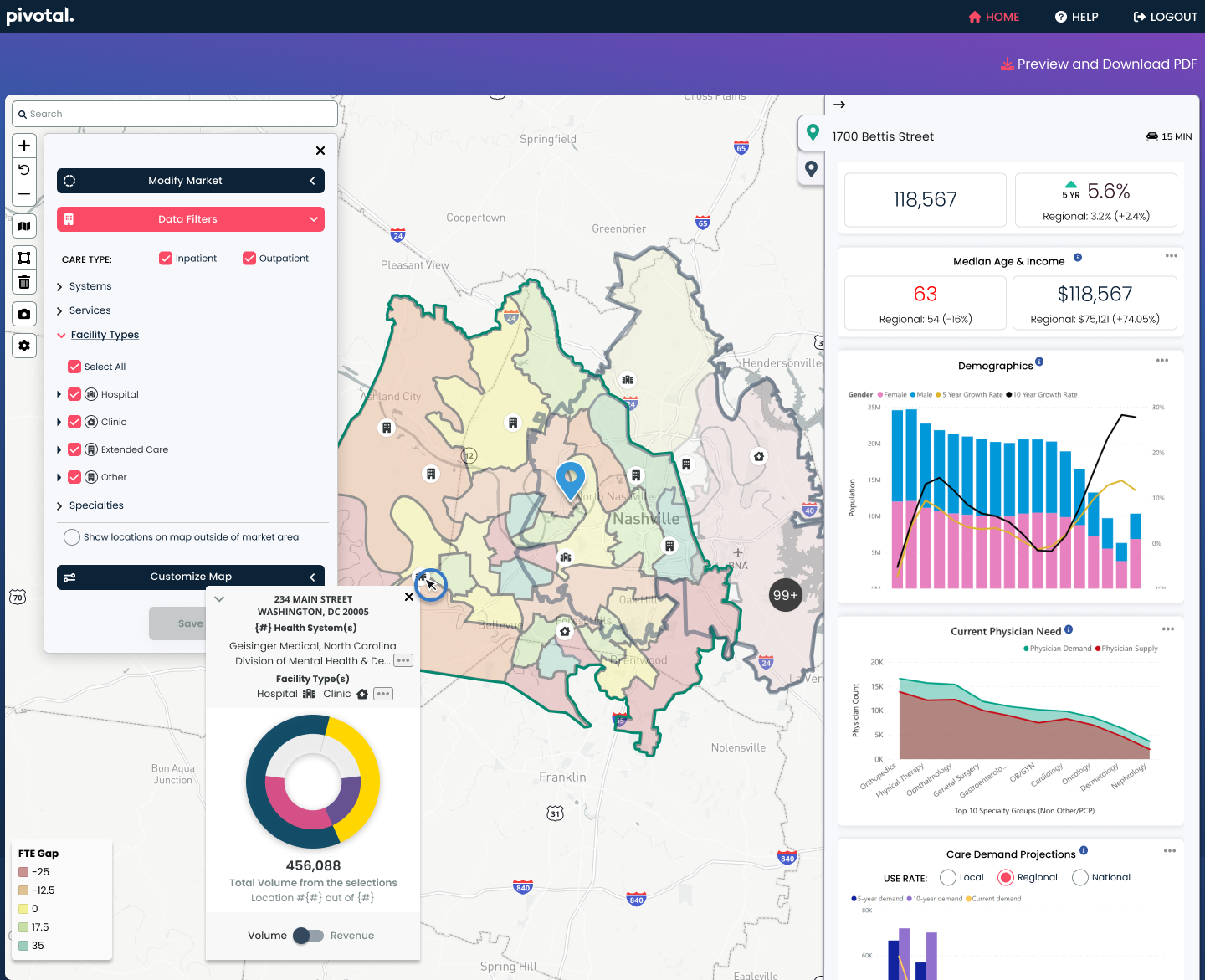
When viewing the map, our users wanted to know quickly, the number of facilities that were included in the cluster as a way of determinining whether to delve deeper and click into the cluster to explore more.
The solution was to add the number of facilites on the cluster icon itself (if the number was in the hundred's, we simply displayed 99+ for space saving and glancability).
Losing ones place in a complex, data-rich map was a pain-point according to our users, which we learned after surveys and intervierws were cunducted for our research. We needed a way to allow our users to learn more about the facilites within the cluster, while avoiding zooming in and losing ones place.
The solution was to enable a popup that would appear once the user clicked on the cluster, that gave much more information about what the cluster contained. This included, but was not limited to, the type of facility in the area, the address of the building, and the affilation the facility belonged to.
When you have a long list of address, such as with a cluster, it can be difficult to find what your looking for or just discover, by simply scrolling.
Our solution was to add search that would allow for quick access if you had a specific address, facility or affiliation in mind.
Our research showed that our users did not like or do well with zooming into the map, as they tended to lose their place on the map. When zooming back out to a birds eye view, if was difficult to get back to the original search location.
Our solutiuon was to not requiring zooming by giving enough information about what is in the cluster from the cluster hover, or pop-over so the user does not lose their place in the current map view.
User story
As a Pivotal user, I want to know what buildings are contained in a cluster, so I can continue my analysis without losing the full context of the market.


Control over volume information
Separating the UI with a floating toggle
- Ability to toggle visualization of a donut graph(s) and simplified view
- Improve loading speed
- Ease of finding toggle control
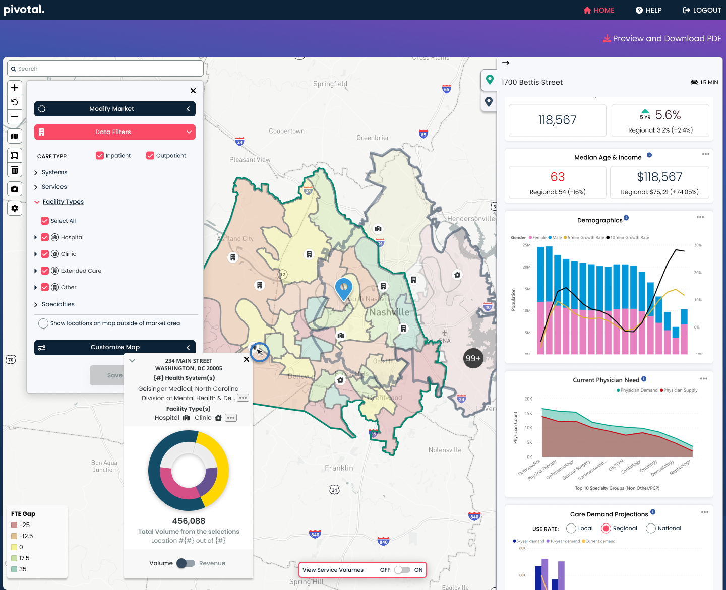
Complicated visuals were being displayed for each facility marker, creating more visual noise on the map, distracting our users from finding the information they needed, digesting it and ultimatly making an actionable decision.
Our solution was to remove the donut graphs from the markers on load, only showing them when the user wanted more information. We allowed them to be displayed when the user clicked the toggle control switch.
By having all the donut graphs displaying on load slowed down the server. This made it look like there was no data available, or an error had occured.
Not displaying the donut graphs on load helped this problem as well. We were able to load less data, allowing for a quicker server response.
There were a lot options that could be selected and controlled, such as giving the ability to select services and subservices, thresholds for clustering, etc. A way was needed to clearly show how to toggle such an important function.
Our solution was to display an, always visible, floating toggle control that was in the bottom-center of the page. This allowed us to have a lighter, more spread out UI, while also making it clear to the user how to control the donut graph visuals.
User story
As a Pivotal user, I want to have control over turning on the volumes view on the map for the facilities shown, so I can only invoke that information when I am ready to analyze it or use it in the presentation to my customer.


