iOS App UX Design
SpiderOak Mobile for iOS - Version 2

Issue addressed
Our iOS and Android application was unpopular due to users accidentally logging themselves out. Confusing popups and usability issues were getting in the way of users viewing and downloading files.
A solid, elegant and functional mobile application was crucial for new user signup and customer retention. Prompting us to ask questions like:
How can we streamline the app?
The application's speed was important. It took a long time to view files.
Version 1 of the application was annoying users with popups stating a file was downloading. It confused users, as it looked like an error occurred. The application seemed like it froze during the process. Promting users to ask questions like:
Why is this app so slow?
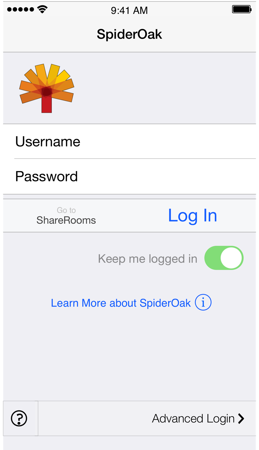
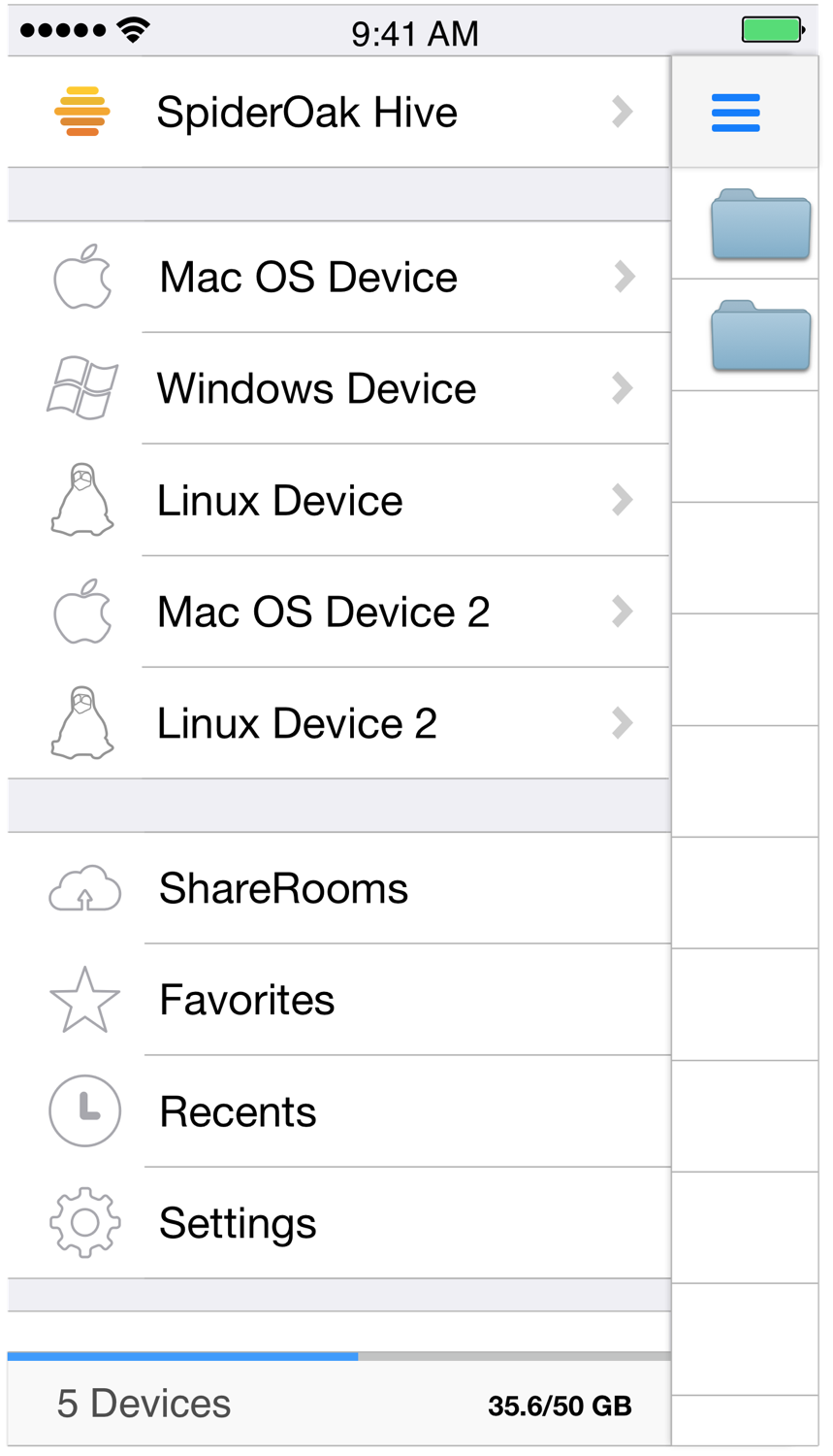
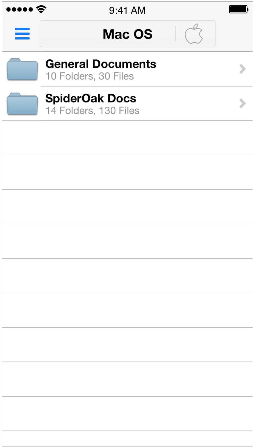
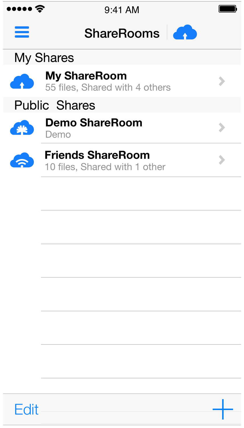
Version 2 of the SpiderOak mobile application for iOS
Mentioned on Engadget.


Approach
I compiled online reviews, app store reviews and customer support emails. Interviewed stakeholders on longstanding issues, finding trends of pain points users were seeing. Our company policies didn't allow for contacting users directly for research, so I made use of existing user data and public data on the web. Asking questions like:
Why don't people like the app?
What are users saying?
Alternatives considered
At first I was tasked with finding usability improvements in the existing application. Updating the applications already developed. A web-based or HTML5 version was also under consideration over developing a native application. Since our goal was improving speed and user experience, developing a new, native application was my recommendation. Asking questions like:
What technologies will give users the fastest experience?
Role and work performed
I researched current technology trends, speed and development issues in native vs. HTML5 applications I analyzed user reviews and support emails. Collaborated with support and stakeholders, finding pressing user requests to design for. Designed the storyboards, wireframes and hi-fidelity mockups of app prototypes and found the developer to code the app. Asking questions like:
What issues should I address in the redesign?
How will this app look and function?
Tools used
- OmniGraffle and Sketch - storyboards and mockups
- Adobe Illustrator - vector graphics
- Adobe Photoshop - bitmap graphics
- Outlining apps - information architecture, structure of user-flows
- Prototyping (web)-apps - simulate user-flows, find potential issues.
Outcome
A well-received application, improved app store reviews, a green light to start the Android counterpart and redesigning our file viewing interface for the web. Asking questions like:
How can we bring this apps look, style and funtionality to the web?
Concurrent projects
I was working on visual improvements for the existing mobile applications. As well as starting the designs for the iPad and Android applications, installer graphics and icons for our desktop application. Asking questions like:
Would our users be more comfortable browsing files on the web if it looked and funtioned like it does on mobile?
Lessons learned
I would have liked to have had a more elaborate beta program, bringing in individuals to interview and observe. Because of the need to protect anonymity and privacy of SpiderOak accounts, I would create a set of 20 (or so) dummy accounts, filling them with a sampling of random data. I'd have used analytical and automated QA and user testing tools to report bugs as well as implement an in-app feedback mechanism. Asking questions like:
Are there issues with the app we aren't catching with QA?
What is it about the app that users are really enjoying?


